A winning pitch deck fits in 10 to 15 slides, takes 3 to 5 minutes to deliver out loud, and leaves one single impression: this is an investment opportunity, not a plea. On a first viewing, an investor spends an average of 3 minutes and 44 seconds on a deck (DocSend 2024 data). If your first two minutes don't give them chills, the rest no longer counts. The structure that works fits in 14 slides: cover, problem, meta-problem, why no one has cracked it, "we cracked the code," solution, how it works, market, competition, traction, go-to-market, roadmap, team, valuation and ask. The legendary decks (Transferwise 2011, Revolut, Airbnb 2008) all follow this logic, even when they compress it into 9 slides. This guide gives you the swanbase method, drawn from hundreds of pitches coached in our "Cold Shower" sessions, with 10 examples to break down and the 7 mistakes that kill a deck live.
What a pitch deck is (and what it isn't)
A pitch deck is a short presentation, 10 to 15 slides, that you use to convince an investor to spend time on your project. It's a tool for seduction, not a reporting document. Its job isn't to say everything, it's to give enough clues that the person across from you wants to learn more.
Most of the founders who show up to a Cold Shower at swanbase confuse the pitch deck with the business plan. These are two very different objects, with two different readers, at two different moments in the fundraising process.
The one-sentence definition
A pitch deck is the trailer for your startup. The full movie is the business plan, the data room, the due diligence conversations. A trailer shouldn't give away the ending, it should make you want to buy the ticket.
Pitch deck vs business plan vs executive summary
All three documents coexist in a fundraising process and are often mixed up. Here's what sets them apart.
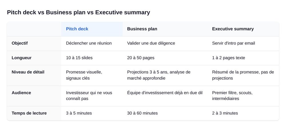
The pitch deck is a visual support of 10 to 15 slides, read in 3 to 5 minutes, aimed at an investor who has never heard of you. Its goal: to trigger a meeting.
The business plan is a 20 to 50 page document, highly detailed, with financial projections over 3 to 5 years and in-depth market analysis. It gets read during due diligence, by someone who already knows you. Its goal: to convince an investment team to line up a check.
The executive summary is the hybrid, 1 to 2 pages of text, that sums up the promise. It works as an intro email, sometimes replacing the deck in the very first approach.
A swanbase tip: don't cobble all three together at once. Build the deck first, because the 14-slide constraint forces you to clarify the proposition. Everything else gets built around it.
The 3 versions of the deck to prepare
You don't need one deck, you need three. It's a reflex we install in sessions at swanbase, and it saves a huge amount of time during a roadshow.
- The teaser (3 to 5 slides). A visual executive summary, to send in a cold email before the first video call. It has to stand on its own without you next to it.
- The master deck (14 to 15 slides). The full version with appendices, sent after a positive first meeting, read by the investor alone.
- The oral support (less text, more images). The version you project on a video call or in person while you talk. The slides back up your words, they don't replace them.
Making all three takes effort. Not making them costs you more.
The golden rule: a pitch deck is an opportunity, not a plea
If there's one thing you take away from this guide, let it be this. We repeat it at every Cold Shower, because it's the thing no one else says and every investor thinks.
"Your pitch deck has to feel like an investment opportunity above all else. You can't just say it's an opportunity, you have to do everything so that it comes across as one. If your pitch deck looks more like a plea, you're not in a position of strength to raise funds." (Vincent, swanbase)
The difference that changes everything
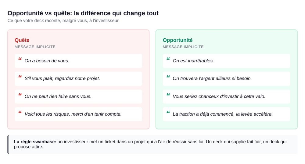
A "plea" deck starts by explaining everything you can't do without money. It begs. It justifies. It complains about the competition. It lists the risks. It ends on an empty "Questions?" slide and an awkward smile.
An "opportunity" deck shows traction that has already started, a product that exists, a team that knows where it's headed, and a raise that is an acceleration, not a survival move. It doesn't ask, it offers. It doesn't justify, it demonstrates. It assumes the money will arrive eventually, with or without this particular investor.
The nuance is psychological. An investor puts a check into a project that looks like it will succeed without them. They don't put a check into a project that says "we need you to exist." It's not a matter of politeness, it's a matter of information asymmetry: if you need them, there's probably a reason, and that reason makes them run.
What an investor feels when opening your deck
On average, they spend 3 minutes 44 on your deck, according to the DocSend 2024 study that analyzed thousands of viewings. They scan. They look for three signals: is the problem massive, is the team credible, does traction exist. The rest is noise.
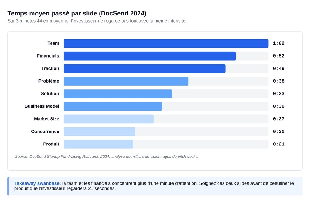
The two slides they linger on the longest are the team (1 minute 02 on average) and the financials (52 seconds). Your product, they look at for 21 seconds. Your competition, 22 seconds. Your market, 27 seconds. That's the real hierarchy of attention.
Design your deck so the 3:44 count. Not to impress your mom.
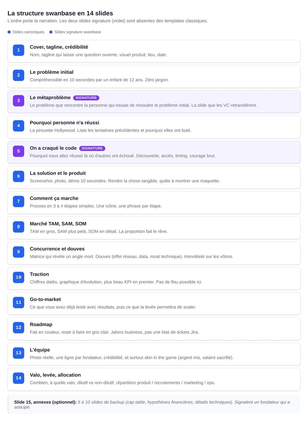
The swanbase structure in 14 slides
This structure is the result of hundreds of decks coached in the Cold Shower. It folds in the logic of the classics (Sequoia, Transferwise, Airbnb) and adds two slides that French-language guides forget: the meta-problem and "we cracked the code." Respect the order. The order carries the narrative.
Slide 1, Cover, tagline, instant credibility
Startup name, a tagline that sparks curiosity (not one that explains everything), a clean product image or logo, location, date. If your tagline is "the B2B SaaS platform for SMEs," redo it. A good tagline leaves a question open. "Your personal money cloud" (Revolut) works because it creates an image.
Slide 2, The initial problem
Understandable by anyone in 10 seconds, zero jargon. A 12-year-old should be able to rephrase it. "Banks take a 3 to 6% commission on international transfers." That's Transferwise. Crisp, precise, concrete.
Slide 3, The meta-problem (the most important slide)
The meta-problem is the problem faced by the person trying to solve the initial problem. Not "I'm hungry," but "the options for getting food delivered cost too much, take 50 minutes, the courier goes to the wrong door, the restaurant forgot half the order." That's the meta-problem that sells.
You won't find this distinction in any competing guide. And yet it's what separates a forgettable deck from a deck that a VC forwards to their partners that same evening. If you have to cut a slide, never cut this one. Address the meta-problem first.
Slide 4, Why no one has cracked it until now
The "Hollywood twist." You list the earlier attempts (often very good ones) and explain why they hit a wall. This slide protects your pitch against the killer question: "but why has no one done it before if it's so obvious?" It can be woven into the spoken story without a dedicated slide if space is tight.
Slide 5, "We cracked the code"
The signature swanbase slide. It's the more human, French-language version of the "unfair advantage" you see everywhere on LinkedIn. You explain why you are going to succeed where others failed: a technical discovery, a regulatory building block, an improbable meeting, a market shift, raw courage.
This isn't a "team strengths" slide, it's a "why us, why now" slide. Be specific. "We developed a proprietary algorithm" convinces no one. "We're the only ones to have secured direct API access to X, signed last October" convinces immediately.
Slide 6, The solution and the product
Show the product. A screenshot, a photo, a 10-second video demo. The more you show the product, the better, very very honestly. A product slide with just text is a waste. An investor wants to see what it looks like.
If you're at the idea stage with no product, show a mockup, a wireframe, a fictional interface. The goal: make the thing tangible.
Slide 7, How it works
The process in 3 or 4 simple steps. "The user does X, then Y, then Z, and gets W." Visually: three or four columns, one icon per step, one sentence per step. No more.
Slide 8, Market, TAM/SAM/SOM
The Revolut technique. You start from the global market (TAM) in large format, then narrow to the serviceable market (SAM), then to the initial market (SOM) in small print below. The visual effect is critical: the investor first sees "100 billion dollars" and then "5 million for the first tier." The proportion builds the dream.
Watch out for the opposite trap, a market that's too narrow. If your TAM is "50 million skaters," that's a bit thin. Widen it to the adjacent segment to show ambition, then pin down the initial market. Don't lie, but don't shrink yourself either.
Slide 9, Competition and moats
A one or two dimension matrix, the Revolut technique. The idea: show that you're playing a different sport. Not a matrix where you're top-right with every box checked (no one believes it). A matrix that reveals a blind spot in the market, with you sitting in it.
Moats (economic moats, a Warren Buffett reference) are the barriers to entry that protect your position: network effect, proprietary data, an exclusive contract, a technical building block that's hard to reproduce, brand. Be honest about yours. A founder who says "we don't have moats yet, we're building the first one with this raise" is more credible than a founder who invents three imaginary defensive advantages.
Slide 10, Traction
The one slide that never forgives vagueness. Dated numbers, a growth chart, your best KPI first. Monthly revenue, number of active users, retention, signed letters of intent. Whatever can be quantified must be.
No traction? Own it. Show weak signals (a waitlist, community engagement, letters of support). The worst option is to hide the absence behind corporate vocabulary.
Slide 11, Go-to-market
Split it in two: what you've already done, with results, then what you're going to do with the raise. Investors love this structure because it proves you've already tried things. "We tested 4 channels, 2 work, here are the associated CACs, we're going to scale those two with the raise."
Slide 12, Roadmap
The Transferwise technique. What's done appears in color, what's left to do in light gray. The subliminal message: we've only just scratched the surface, there's a huge amount to build, investing now means getting on the train at the right moment.
Be careful not to confuse a roadmap with a feature list. A roadmap is a series of business milestones (reach X users, open Y countries, cross into profitability), not a list of Jira tickets.
Slide 13, The team
A photo (a real one, not an avatar), one line per founder, credibility (degrees, relevant experience, past achievements). And above all: skin in the game. How much each founder has invested of their own money or given up in salary to launch the project.
"Put in the money you've put in, it shows you have skin in the game, that you believe in your project." (Théo, swanbase)
Investors look at this slide for 1 minute 02 on average, longer than any other. This is where they decide whether they trust you.
Slide 14, Valuation, raise, allocation
How much, at what valuation, dilutive vs non-dilutive in two columns if you mix them, how the money will be allocated (product, hires, marketing, ops). Don't rush this slide, it's the question the investor has had in mind since slide 1. If they can't find it clearly, they move on.
Slide 15, Appendices (optional but recommended)
After the closing slide, add 5 to 10 backup slides: a detailed cap table, financial assumptions, technical details, market studies. They aren't shown during the pitch, they exist to answer questions without breaking the flow. A deck with appendices signals a founder who has thought ahead.
10 pitch deck examples you absolutely have to break down
Half the articles ranking for "pitch deck examples" just display 35 decks with no context. Here are the 10 that actually serve as references in swanbase coaching sessions, each with its specific takeaway.
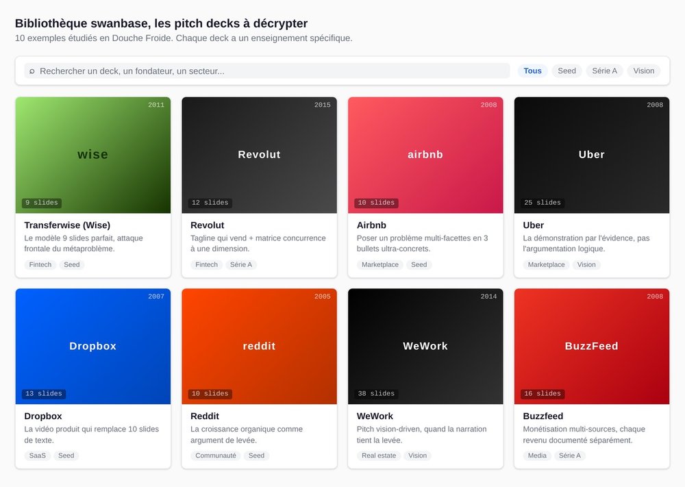
Transferwise (2011), the perfect 9-slide model
Nine slides, not one more. It attacks the meta-problem head-on from slide 2 ("banks take 3 to 6% plus fixed fees on international transfers"). Product visible from slide 3. Roadmap in light gray at the end. This is the template to copy for a minimalist seed pitch. If you don't know how many slides to make, start with 9 and add only if necessary.
Revolut, the tagline that sells and the competition matrix
Two technical takeaways. The market sizing starts from the global figure ("1.8 billion cards issued worldwide") then zooms in on the initial market (UK) in small print below, the proportion effect creating the dream. The competition matrix runs on one dimension, "hard/expensive vs easy/cheap," with Revolut alone in the bottom-left quadrant. Signature tagline: "Your personal money cloud."
Airbnb (2008), how to frame the problem in 3 bullets
The Airbnb 2008 deck is probably the most studied in the world. Its strength: the problem slide in 3 ultra-concrete bullets ("Hotels are expensive. Guidebooks leave out a lot of information. There's no way to book a stay with a local."). Then the solution slide that flips each bullet. Readable in 15 seconds. Copy it when you have a multi-faceted problem.
Uber, demonstration by the obvious
Uber didn't explain its problem. It showed it. Slide 1: rain, no taxi in sight, a waiting crowd. Everyone has lived that. The pitch doesn't argue, it taps a shared memory. Use it when your problem is universal, and therefore unsellable through logical argument (because everyone already knows it).
Dropbox, the video that replaced 10 slides
The Dropbox seed deck has few slides and a lot of product video. The 2-minute demo does all the convincing. If your product has a visual wow effect, think video before you think slides. A well-made demo is worth 5 slides of text.
Reddit, organic growth as the argument
For a long time Reddit pitched on a single line: "Everything you see is organic, imagine what we'd do with a marketing budget." Then a breakdown of engagement by sub-community (makeup, fitness, fashion advice). Use this logic if you have organic traction: position it as a launch ramp, not an endpoint.
WeWork (2014), when vision carries the raise
WeWork 2014 is a textbook case of a vision-driven pitch. "We don't sell coworking, we sell a service." Membership vs standard office, community vs rent. Use it with hindsight: the rest of the WeWork story is instructive. The lesson: a strong vision can carry a deck, but it can't carry a company on its own.
Buzzfeed, multi-source monetization
Buzzfeed pitched a monetization roadmap across four sources (native advertising, licensing, sponsored content, video). Each source documented, quantified, with an example. Copy it if your business model is complex or multiple: detail the sources one by one rather than saying "freemium + B2B model" in a single line.
Sequoia Capital, the canonical VC template
The official Sequoia template, in 10 slides, is the VC canon. Plenty of decks that look like this have raised. Few stick to it word for word. Cite it as a structural reference, don't copy it as is. Your deck should look like you.
Y Combinator, the brief seed
The YC template is the briefest: 10 slides, very seed-oriented, lots of white space. It forces clarity. If you struggle to keep it under 14 slides, do the YC version in 10 first, and you'll see what's essential.
7 mistakes that kill a pitch deck (spotted in the Cold Shower)
These seven mistakes come up in 80% of Cold Showers, the internal swanbase workshop where founders in the program practice pitching and get torn apart live. They're easy to spot, harder to fix, because each one rests on a reflex that feels natural.
1. Reading your slides
If you read your slides during the spoken pitch, the investor reads in 20 seconds what you take 2 minutes to say. You become redundant. swanbase tip: take your slides, then step behind them, and speak as if you were telling a friend. If you don't know the material well enough to recite it while baking brownies, it's not ready yet.
2. A rushed funding slide
"You swept the money under the rug. You said 'we need 100,000 euros' and boom, next slide." This mistake is systematic. Always explain: how much, at what pre-money valuation, for what (allocation), dilutive vs non-dilutive. An investor who can't find those four elements clearly won't book a meeting.
3. No visible product
Nobody shows their product, which is catastrophic. A "solution" slide with text only is a wasted opportunity. Put in a screenshot, a photo, a demo, a mockup. The more you show the product, the better.
4. Going back to the problem after the solution
Once you've presented the solution, you don't return to the problem. Except through a brief use case ("here's Marie who was struggling with X, now she uses our product"). Otherwise the listener feels you doubt your own solution and want to re-justify its usefulness.
5. The "plea" tone instead of "opportunity"
Covered above. Anything that smells of begging degrades the pitch. Reread each slide and ask yourself: "does this sentence suggest we're unstoppable, or that we need help?" If it's the second, rewrite it.
6. An undersized market
"50 million skaters, that's a bit scary." A market that's too small kills the pitch, even if your product is brilliant. swanbase technique: widen it to the adjacent segment to show ambition, then pin down the initial market. The TAM should make people dizzy, the SOM should be credible.
7. An empty "Questions?" slide
That final slide with just "Questions?" in 120-point font is the definition of a soft ending. Replace it with a valuation + ask recap (echoing slide 14), a clear CTA (next step, expected decision date), or a "Thank you" slide with your contact details clearly legible and one last customer quote. Never end on the void.
The formatting rules that make the difference
Form won't save weak substance, but it can kill strong substance. These four rules sum up what to impose on your deck, whatever tool you use.
10 to 15 slides, no more
Beyond 15 slides, you lose the investor. Beyond 20, they don't finish reading. The constraint is a good thing: it forces you to choose. Every extra slide is a slide that dilutes the message. Appendices don't count toward this total, they sit outside the pitch.
One idea per slide
If you have two ideas, make two slides. The rule looks obvious, and it's broken in 90% of decks. Combined "problem + solution" slides, merged "market + competition" slides, that's a botched job. Separate them. Give them air.
Visual hierarchy (scannable before it's read)
The eye scans before it reads. A slide title should be twice the size of the body. A slide should be readable in 3 seconds without any speaking. If you have to zoom in to read your own slide, redo the layout.
Systematic appendices for Q&A
Anything that doesn't fit in the 14 slides goes into appendices. Detailed cap table, financial assumptions, detailed CAC/LTV by channel, market studies, technical details, long-form team bios. These are your backup ammunition for the Q&A session. A founder who pulls out a perfectly prepared appendix in response to a question gains 10 credibility points.
Tools and templates to build your pitch deck
The tool doesn't make the deck, the content makes the deck. But a bad tool slows the work down and produces slides that reek of a generic template.
Recommended creation tools
Claude Design (Anthropic) is, in 2026, the best way to build your deck. You describe your company, the 14-slide structure, the visual style you want, and Claude generates a clean HTML/CSS deck that you iterate on by voice. What an agency used to take three weeks to deliver, you produce in an afternoon, with output that reflects your voice rather than a corporate template. It's the default option to try first.
Figma remains solid for founders who want a bespoke design and control over every pixel. A moderate learning curve, total visual freedom, native collaboration. Free for personal projects.
Pitch (pitch.com) is the dedicated tool, built for startups, with pitch-deck-specific templates, built-in analytics (you see who read what, which slide was viewed most), and versioning. Ideal if you're on an active roadshow and want to track engagement.
Canva works for a quick first deck if you have nothing else on hand. Ready-made templates, intuitive editing. The downside: your deck looks like 50,000 other Canva decks. Acceptable at pre-seed, less so at Series A.
Google Slides and PowerPoint get the job done, but force you to do the design yourself. Reserve them if you have a designer on the team or if you enjoy spending 20 hours aligning pixels.
Notion can serve as an executive summary support (the document version), not a pitch deck. Native Notion slides aren't up to the level.
Recommended free templates
Start with these three references: the Sequoia Capital template (the 10-slide VC canon), the Y Combinator template (brief, seed-oriented), and the Figma resource library that gathers 16 annotated pitch deck examples. Don't copy them word for word, draw from the structure.
Should you use a specialized agency?
No, it's a waste of time and money. An agency charges 3 to 8k€ for a deck, meaning 1 to 2% of your seed raise burned on an object that must never be outsourced. The pitch deck tells the story of your company, your obsessions and your voice: an outside provider produces a very clean PowerPoint that investors smell from ten kilometers away as an "agency deck," exactly what you want to avoid.
The right approach: do it yourself with Claude Design. You brief Claude on your company, your 14-slide structure, the tone, the colors. You produce a first draft in a few hours, then iterate until it rings true. You keep control of the narrative, you get output better than most agency decks, and you save 3 weeks and 5k€.
The only case where an agency can be justified: Series A and beyond, with a need for very strong graphic consistency within an already-defined brand universe, and an in-house designer to frame the delivery. For everyone else, 99% of founders, you're wasting your time by outsourcing.
FAQ
How many slides in a pitch deck?
An effective pitch deck has 10 to 15 slides for the spoken pitch, plus 5 to 10 appendix slides for Q&A. Below 10, you're missing essential elements (team, traction, raise). Above 15, you lose the investor. Legendary decks like Transferwise 2011 fit in 9 slides, proof that concision pays.
What's the difference between a pitch deck and a business plan?
The pitch deck is a short visual support (10 to 15 slides, 3 to 5 minutes to read) meant to convince an investor to book a meeting. The business plan is a long document (20 to 50 pages) with detailed financial projections, read during due diligence. The pitch deck creates desire, the business plan reassures. You make the pitch deck first.
How long does a pitch deck last?
A spoken pitch deck lasts 3 to 5 minutes in elevator form, 10 to 15 minutes in full pitch form. An investor spends an average of 3 minutes 44 seconds reading a deck on first viewing (DocSend 2024 study). The first two minutes are decisive: if they don't create emotion, the rest goes unread.
Which slide should you polish first?
Slide 3, the meta-problem. It's the most important in the deck, the one that determines whether the investor understands the market is real. The meta-problem isn't the initial problem ("I'm hungry") but what the person trying to solve it runs into ("the options cost too much, are too slow, don't arrive at the right door"). It's absent from most competing guides.
Which tool should you use to create a pitch deck?
Claude Design (Anthropic) is the default recommendation in 2026: you brief Claude on your company and structure, iterate by voice, and produce a bespoke HTML/CSS deck in an afternoon. Solid alternatives: Figma for a bespoke design, Pitch (pitch.com) for built-in roadshow analytics, Canva for a very quick first deck. Google Slides and PowerPoint get the job done but require a lot of manual pixel pushing. Paying an agency to make your slides is a waste of time in 99% of cases.
How do you present your pitch deck to investors?
Prepare three versions: a 3 to 5 slide teaser sent in a cold email, a 14 to 15 slide master deck sent after a first meeting, and an oral support with less text and more images projected during the pitch. Never read your slides during the spoken pitch, speak as if you were telling a friend, letting the slides back up your words rather than repeat them.
Where these observations come from
The 7 mistakes and the 14-slide structure presented here don't come out of a book. They're the patterns observed in The Cold Shower, the internal swanbase workshop where founders in the program practice pitching and leave with unfiltered feedback. Hundreds of decks put through it, hundreds of corrections repeated: the same seven mistakes come back, the same structure works.
If you want access to that feedback, the way in is to apply to the swanbase program. We'd rather tell you what's wrong with your deck before you show it to a VC than let you find out in front of an investor.
A good pitch deck won't get you the raise. A bad pitch deck will stop you from raising. Take it seriously.